All pages that lists items are very similar in their appearance and functionality. In this section we will describe the things that are common for most (if not all) list pages.
Use the menu to open a page listing items. Most list pages can only list one type of items. For example: use the menu to list samples and the menu to list experiments.
![[Tip]](../../gfx/admonitions/tip.png) |
Tip |
|---|---|
An example of a list page that can list
items of several types is found by going to
.
This page lists all items that you are the owner of. It has a few limitations:
There are also several similarities:
|
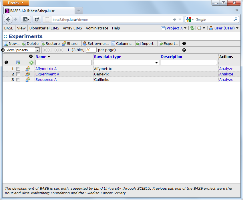
The typical list page contains the following important elements:
- 1. Toolbar
-
A toolbar with buttons for various actions such as for creating a new item, for deleting items and for configuring columns. Depending on the permissions of the logged in user some buttons may be disabled (greyed out) or not shown at all.
- 2. Navigation bar
-
If there are many items the list will be divided into pages, each one showing a limited number of items. The navigation bar allows you to move to other pages and specify how many items each page should display. The navigation bar is repeated at the bottom of the list so you do not have to scroll back to the top of a long list just to get to another page.
- 3. List of presets
-
A list with preconfigured settings which allows you to quickly switch between different layouts (sort order, visible columns, filter settings, etc).
- 4. Column headers
-
The columns headers can be used for selecting sort order.
- 5. Filter bar
-
The filter bar allows you to search for items. Use the
 icon to add more filter rows.
Most lists are by default sorted by the name of the item. This can be changed by clicking on the column header of another column. If you click on the same column twice the sort order is reversed. A downwards or upwards pointing arrow is displayed next to the column header in the column that is currently used for sorting. Column headers that are black cannot be used for sorting.
It is possible to use more than one column for sorting. Press and hold one of the CTRL, ALT or SHIFT keys while clicking on another column header. The original sorting is kept and the new column is used for sub-sorting the list. The procedure can be repeated with more columns if you need to sort on three or more columns. To revert to sort by only one column again click a column header without holding down any key.
If the list contains many items you may need to use a filter to be able to find the item you are looking for. The input boxes on the line below the column headers are used for filtering. Most columns are filtered using a free-text input box, but some columns that can only take a few distinct values use a selection list or radio buttons instead. The selection list and radio buttons are very simple to use. Just select the alternative that you want to filter on. The list will be automatically updated when the selection has been made.
The free-text filter is a bit more complex. By default, an exact match is required, use % as a wildcard character that matches any character. For example, the filter
only matches the same exact string, but the filter
matches
If you want to filter on several values at the same time, separate the values in the filter input box with the “|” character. For example, a filter text like
matches both “Experiment A” and values that begin with “C”.
You can also use operators to find items which has a value that is greater than, less than or not equal to a specific value. This is mostly useful on numeric or date columns but also works on text columns. The operator must be entered first in the free-text box, for example
to find items which has a value less than or equal to 10. Here is a list of the supported operators:
List of operators supported by the free-text filter
- <
- Less than
- <=
- Less than or equal to
- >
- Greater than
- >=
- Greater than or equal to
- =
- Equal to (useful to find items with a null value). Supports filtering on more then one value.
- <>, !=
- Not equal to (useful to find items with a non-null value). Supports filtering on more then one value.
- ==
- Same as = but interprets “|”, “%” and other special characters literally. Use this when you need an exact string match.
- ><
-
Within a range. Two values separated by “|” are required.
For example,
><10|20to find values between 10 and 20 (inclusive).
Other special characers used by the free-text filter
- ¤
-
Can be used as a suffix in annotation columns where the annotation type supports project-specific annotations. When present, the filter will only match items that:
- Has a default value (can be any value).
- Has a project-specific annotation that matches the filter.
=10¤matches items that have a default value (any) and a project-specific annotation with the value 10.<>¤matches all items that has a project-specific value overriding the default.![[Note]](../../gfx/admonitions/note.png)
Note Just because an item has a project-specific annotation there is no guarantee that the value is actually different from the default value.
Most list pages allows you to add more than one filter row by clicking on the
icon at the start of the row. Each filter row is an independent filter set
that extends the search result with more items (eg. it is logically equivalent to an OR
condition).
Use the
 icon to remove an existing filter row.
Some (numeric) columns have values with units. There are, for example, the Original quantity and Remaining quantity columns for biomaterials, which have values in micrograms (µg), and annotations which may have any unit.
When filtering on a column that has a unit, numeric values without units are interpreted as the default unit for that column. But it is also possible to add a unit to the filter value. The examples below are filtering on the original quantity column of a biomaterial:
matches biomaterials with an original quantity >=500µg.
matches biomaterials with exactly 100, 200 or 300 micrograms.
It is also possible to mix units in a single filter:
which matches 100, 200, 300, 500 and 1000 micrograms.
![[Warning]](../../gfx/admonitions/warning.png) |
Be aware of rounding errors |
|---|---|
|
All filter values with a unit that is different from the default unit are converted to the default unit before being applied. Since numeric conversions are never exact down to the last decimal, this may result in problems to filter with an exact match. The last example above could, for example, be converted to: 100, 200, 300, 500.000001 and 999.99999998. |
|
Hard-to-type characters |
|---|---|
|
Some units contains hard-to-type characters. For example, the greek letter µ in µg, and m² and m³ for areas and volumes. In all those cases it is also possible to use ug, m2 and m3, respectively. |
|
Units are case-sensitive |
|---|---|
|
All units are case sensitive. The main reason for this is that it must be possible to tell the difference between milli (m) and mega (M) prefixes, for example, mJ and MJ. |
Most lists show only a small subset of the columns it is capable of showing. There are several ways to change which columns that are visible and in which order.
-
Right-click on any column header. This will bring up a context-sensitive menu containing all possible columns. Select a column in the menu to show it. It will be inserted right after the column that was right-clicked. If the selected column is already visible it is hidden instead.
-
When hovering with the mouse inside a column header, an × is displayed in the top right corner. Click the × to hide the column.
-
It is possible to drag columns to change their order. When hovering with the mouse inside a column header, left-click the mouse and hold it. Move the mouse to another column either to the left or right and release the mouse button. The dragged column is moved to the location indicated by the black vertical bar.
-
Use the button to open a dialog (see below) that allows you to select which columns to show and the order in which they are shown. This is the most powerful way to configure the columns and includes the possibility to save a certain configuration as a preset.
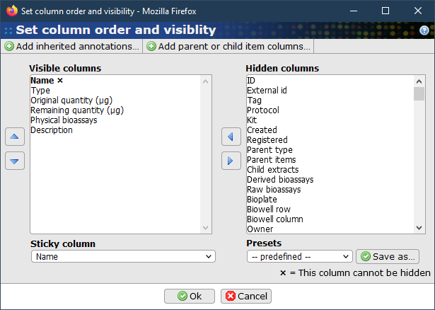
- Visible columns
-
Shows the columns that are currently visible. Use the up/down arrow buttons to arrange the order of the visible columns. The topmost column is shown to the left. Use the right arrow button to move columns from this list to the hidden columns list. Columns marked with an × are required and cannot be hidden. In most lists the Name column is the only column that is required.
- Hidden columns
-
Shows columns that are not currently visible in the list. Use the left arrow button to move columns from this list to the visible columns list. This list can get very long if a lot of annotation types have been defined. It is possible to limit the number of columns with the filter options above it. In the example, the Only related to Library option is selected and will hide columns that are not related to the Library subtype. The Only annotations filter will hide all columns that are not annotations.
- Sticky column
-
In most lists one column can be selected to be sticky, which means that it will always be visible and stick to either the left or right side of the browser window when scrolling would take outside the visible area. In most lists the Name column is the default sticky column.
- Presets
-
A dropdown list that allows you to select a set of preconfigured columns. You may also create your own preset if you often need to switch between different configurations. The list of presets is the same as the one described below, but if used from this dialog the presets only affects the visible columns and not filters or sort order.
- Add inherited annotations...
-
Used for adding columns representing annotations that are inherited from parent items. Since a system may define a lot of different annotation types, there are no pre-defined columns that represent inherited annotations. Clicking on the buttons opens a dialog that allows you to select any annotation type that you have access to. Selected columns will be marked with [I] after their names.
Not all items can inherit annotations This functionality is of course only available in lists that display item that can inherit annotations. For more information about inheriting annotations see Section 10.2.2, “Inheriting annotations from other items”.
- Add parent or child item columns...
-
This function can be used to add columns that display data from a parent or child items. The function is enabled for biosources, samples, extracts, and the physical, derived and raw bioassays, and requires that items are classified with a subtype.
Use the button to apply your changes or the button to close the pop-up without saving.
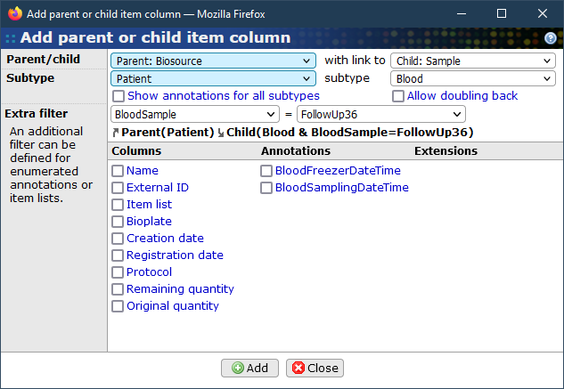
- Parent/child
-
Select the main item type of the parent or child items. This list will have different options depending on the current context.
- Subtype
-
This list will automatically be updated with all available subtypes for the selected parent or child item type. It is not possible to select items without a subtype.
- with link to
-
This is an optional selection that is only available if a parent item type has been selected in the left list. In this list is possible to select an item type that should be a child type of the selected parent type. A subtype for the child item must also be selected.
- Show annotations for all subtypes
-
By default, only annotations that are linked to the selected subtype are included in the list. Enable this option to include all annotations that are enabled for the selected main item type.
- Allow doubling back
-
The normal operation when both a parent and child selection has been made is that the path used when going up to the parent is ignored when going down to the child. If this option is checked then it is allowed to "double back" the same path also when going down to the child item.
- Extra filter
-
It is possible to define an extra restriction for the parent/child items. The first list contain annotation types and item lists. Note that only annotation types that are defined with an enumeration can be used. When an annotation type is selected, the right list is updated with the possible values. Only a single value can be selected. The item lists must match the selected parent/child type and subtype.
- Columns/Annotations/Extensions
-
When the parent/child selection contains a valid combination, the table will display all possible columns that can be selected and added to the table. Most regular properties such as Name and Registration date can be selected and are displayed in the Columns column. All annotation types that has been defined and linked to the selected subtype are displayed in the Annotations column. It is also possible for external extensions to add more columns that can be selected in the Extensions column.
Use the button to add columns to the table. It is possible change the parent/child item type and subtype to add more columns. When you are done, use the button to close the dialog.
|
Limitations for parent and child item columns |
|---|---|
|
While it is possible to display and filter by the values from the parent and child items, it is not possible to use them for sorting. This is because the values are not loaded immediately together with the rest of the table. Instead, there are placeholders that will be filled with values later. This is usually quick, but may take several seconds depending on the amount of intermediate steps between the parent and child items. |
The view / presets dropdown has three main functions:
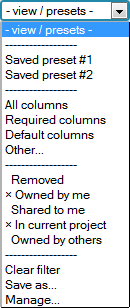
-
Switch between different configuration presets. The top of the dropdown contains user-defined presets (Saved preset #1 and #2) and a few preconfigured presets. The user-defined presets are used to store a complete table configuration, including:
- Which columns are visible and their order
- The column (or columns) used for sorting
- Filter settings
- The number of items per page and the current page
The preconfigured presets only affects the visible columns as follows:
-
All columns - Show all columns.
-
Required columns - Show only the required columns. Usually only the Name column is required.
-
Default columns - Show the default set of columns.
-
Other… - Open the configure columns dialog box, described in Section 5.4.3, “Configuring which columns to show”.
-
Filter items by the removed status and the access permissions to an item.
-
Removed - If checked, items that have been moved to the trashcan are shown, otherwise they are hidden.
-
Owned by me - If checked, items that the logged in user owns are displayed, otherwise they are hidden.
-
Shared to me - If checked, items that are owned by other users but shared to the logged in user are displayed, otherwise they are hidden.
-
In current project - If checked, items that are linked with the current project are displayed, otherwise they are hidden. It does not matter if the logged in user is the owner or not. This option is only available if a project is active.
-
Owned by others - This option is only available to administrators and will display items that are owned by other users.
The default is to display item that the current user owns and, if a project is active, items in that project.
-
-
Administrate the presets
-
Clear filter - Clears all filters.
-
Save as… - Save the current configuration as a preset.
-
Manage… - Opens a dialog where you can remove saved presets. You can also load saved presets from the dialog, but it is quicker to just use the dropdown list for this.
-
If you select the Save as… option from the view / presets dropdown the Save preset as dialog is opened.
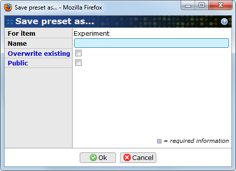
- For item
-
The type of item the preset is saved for.
- Name
-
The name of the preset. The name must be unique.
- Overwrite existing
-
If a preset with the same name already exists, it is overwritten if this checkbox is checked.
- Public
-
This options is only available for users which has the SHARE_TO_EVERYONE permission. If checked the preset is visible to all users.
Use the button to save the preset or the button to close the pop-up without saving.
If you select the Manage… option from the view / presets dropdown the Manage presets dialog is opened.
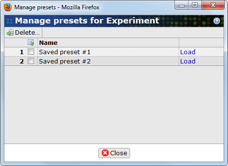
From this dialog you can delete or load presets.
To delete presets, first mark the checkbox in front of each preset you want to delete. Then, click on the button. You will get a warning about that the action cannot be undone. Unlike other items, the presets are not moved to the trashcan. Click on to delete the preset.
|
Edit a preset |
|---|---|
|
It is not possible to edit a preset directly. To change an existing preset you must:
|
Use the button to close the pop-up.