#2081 closed enhancement (fixed)
Improve visibility of child items in the "Item overview"
| Reported by: | Nicklas Nordborg | Owned by: | everyone |
|---|---|---|---|
| Priority: | major | Milestone: | BASE 3.11 |
| Component: | web | Version: | |
| Keywords: | Cc: |
Description (last modified by )
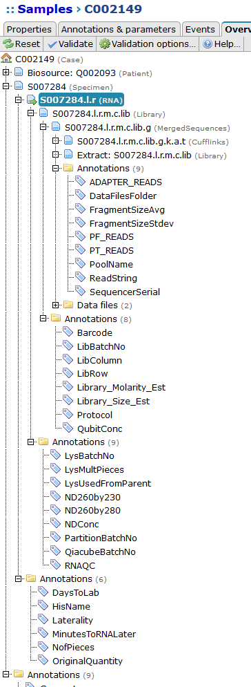
The "Item overview" is a useful tool to quickly get an overview of items that are related to each other. However, when the tree is big and contains a lot of items it becomes difficult to follow the dotted lines to the correct child items. For example, which "Annotations" folder belongs to the selected "RNA" item in the image?
| Before | After |
 | 
|
Attachments (2)
Change History (5)
by , 8 years ago
| Attachment: | item-overview.png added |
|---|
comment:1 by , 8 years ago
| Description: | modified (diff) |
|---|
comment:2 by , 8 years ago
| Resolution: | → fixed |
|---|---|
| Status: | new → closed |
by , 8 years ago
| Attachment: | item-overview-fixed.png added |
|---|
comment:3 by , 8 years ago
| Description: | modified (diff) |
|---|
Note:
See TracTickets
for help on using tickets.

(In [7347]) Fixes #2081: Improve visibility of child items in the "Item overview"
I have made two changes.