All pages that lists items are very similar in their appearance and functionality. In this section we will describe the things that are common for most (if not all) list pages.
Use the menu to open a page listing items. Most list pages can only list one type of items. For example: use the → menu to list samples and the → menu to list experiments.
![[Tip]](../../gfx/admonitions/tip.gif) |
Tip |
|---|---|
An example of a list page that can list
items of several types is found by going to
→ .
This page lists all items that you are the owner of. It has a few limitations:
There are also several similarities:
|
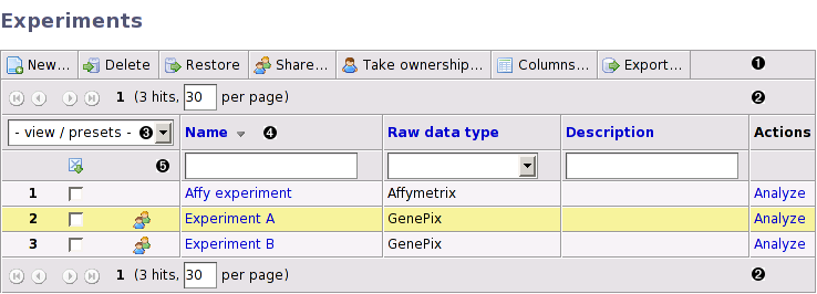
The typical list page contains the following important elements:
- 1. Toolbar
A toolbar with buttons for various actions such as for creating a new item, for deleting items and for configuring columns. Depending on the permissions of the logged in user some buttons may be disabled (greyed out) or not shown at all.
- 2. Navigation bar
If there are many items the list will be divided into pages, each one showing a limited number of items. The navigation bar allows you to move to other pages and specify how many items each page should display. The navigation bar is repeated at the bottom of the list so you do not have to scroll back to the top of a long list just to get to another page.
- 3. List of presets
A list with preconfigured settings which allows you to quickly switch between different layouts (sort order, visible columns, filter settings, etc).
- 4. Column headers
The columns headers can be used for selecting sort order.
- 5. Filter bar
The filter bar allows you to search for items.
Most lists are by default sorted by the name of the item. This can be changed by clicking on the column header of another column. If you click on the same column twice the sort order is reversed. A downwards or upwards pointing arrow is displayed next to the column header in the column that is currently used for sorting. Column headers that are black cannot be used for sorting.
It is possible to use more than one column for sorting. Press and hold one of the CTRL, ALT or SHIFT keys while clicking on another column header. The original sorting is kept and the new column is used for sub-sorting the list. The procedure can be repeated with more columns if you need to sort on three or more columns. To revert to sort by only one column again click a column header without holding down any key.
If the list contains many items you may need to use a filter to be able to find the item you are looking for. The input boxes on the line below the column headers are used for filtering. Most columns are filtered using a free-text input box, but some columns that can only take a few distinct values use a selection list or radio buttons instead. The selection list and radio buttons are very simple to use. Just select the alternative that you want to filter on. The list will be automatically updated when the selection has been made.
The free-text filter is a bit more complex. By default, an exact match is required, use % as a wildcard character that matches any character. For example, the filter
only matches the same exact string, but the filter
matches
If you want to filter on several values at the same time, separate the values in the filter input box with the “|” character. For example, a filter text like
matches both “Experiment A” and values that begin with “C”.
You can also use operators to find items which has a value that is greater than, less than or not equal to a specific value. This is mostly useful on numeric or date columns but also works on text columns. The operator must be entered first in the free-text box, for example
to find items which has a value less than or equal to 10. Here is a list of the supported operators:
List of operators supported by the free-text filter
- <
- Less than
- <=
- Less than or equal to
- >
- Greater than
- >=
- Greater than or equal to
- =
- Equal to (useful to find items with a null value). Supports filtering on more then one value.
- <>, !=
- Not equal to (useful to find items with a non-null value). Supports filtering on more then one value.
- ==
- Same as = but interprets “|”, “%” and other special characters literally. Use this when you need an exact string match.
Some (numeric) columns have values with units. There are, for example, the Original quantity and Remaining quantity columns for biomaterials, which have values in micrograms (µg), and annotations which may have any unit.
When filtering on a column that has a unit, numeric values without units are interpreted as the default unit for that column. But it is also possible to add a unit to the filter value. The examples below are filtering on the original quantity column of a biomaterial:
matches biomaterials with an original quantity >=500µg.
matches biomaterials with exactly 100, 200 or 300 micrograms.
It is also possible to mix units in a single filter:
which matches 100, 200, 300, 500 and 1000 micrograms.
![[Warning]](../../gfx/admonitions/warning.gif) |
Be aware of rounding errors |
|---|---|
All filter values with a unit that is different from the default unit are converted to the default unit before being applied. Since numeric conversions are never exact down to the last decimal, this may result in problems to filter with an exact match. The last example above could, for example, be converted to: 100, 200, 300, 500.000001 and 999.99999998. |
|
Hard-to-type characters |
|---|---|
Some units contains hard-to-type characters. For example, the greek letter µ in µg, and m² and m³ for areas and volumes. In all those cases it is also possible to use ug, m2 and m3, respectively. |
![[Note]](../../gfx/admonitions/note.gif) |
Units are case-sensitive |
|---|---|
All units are case sensitive. The main reason for this is that it must be possible to tell the difference between milli (m) and mega (M) prefixes, for example, mJ and MJ. |
Most lists show only a small subset of the columns it is capable of showing. Use the button to open a dialog that allows you to select which columns to show and the order in which they are shown.
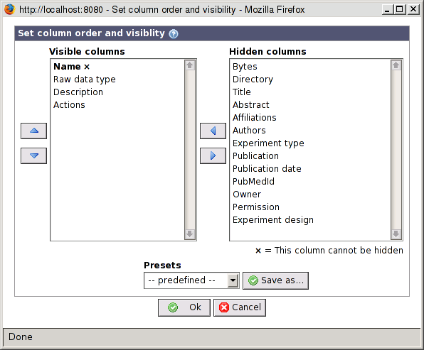
- Visible columns
Shows the columns that are currently visible. Use the up/down arrow buttons to arrange the order of the visible columns. The topmost column is shown to the left. Use the right arrow button to move columns from this list to the hidden columns list. Columns marked with an × are required and cannot be hidden. In most lists the Name column is the only column that is required.
- Hidden columns
Shows columns that are not currently visible in the list. Use the left arrow button to move columns from this list to the visible columns list.
- Presets
A dropdown list that allows you to select a set of preconfigured columns. You may also create your own preset if you often need to switch between different configurations. The list of presets is the same as the one described below, but if used from this dialog the presets does not affect filters, sort order, etc.
Use the button to apply your changes or the button to close the pop-up without saving.
The view / presets dropdown has three main functions:
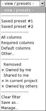
-
Switch between different configuration presets. The top of the dropdown contains user-defined presets (Saved preset #1 and #2) and a few preconfigured presets. The user-defined presets are used to store a complete table configuration, including:
- Which columns are visible and their order
- The column (or columns) used for sorting
- Filter settings
- The number of items per page and the current page
The preconfigured presets only affects the visible columns as follows:
All columns - Show all columns.
Required columns - Show only the required columns. Usually only the Name column is required.
Default columns - Show the default set of columns.
Other… - Open the configure columns dialog box, described in Section 6.4.3, “Configuring which columns to show”.
-
Filter items by the removed status and the access permissions to an item.
Removed - If checked, items that have been moved to the trashcan are shown, otherwise they are hidden.
Owned by me - If checked, items that the logged in user owns are displayed, otherwise they are hidden.
Shared to me - If checked, items that are owned by other users but shared to the logged in user are displayed, otherwise they are hidden.
In current project - If checked, items that are linked with the current project are displayed, otherwise they are hidden. It does not matter if the logged in user is the owner or not. This option is only available if a project is active.
Owned by others - This option is only available to administrators and will display items that are owned by other users.
The default is to display item that the current user owns and, if a project is active, items in that project.
-
Administrate the presets
Clear filter - Clears all filters.
Save as… - Save the current configuration as a preset.
Manage… - Opens a dialog where you can remove saved presets. You can also load saved presets from the dialog, but it is quicker to just use the dropdown list for this.
If you select the Save as… option from the view / presets dropdown the Save preset as dialog is opened.
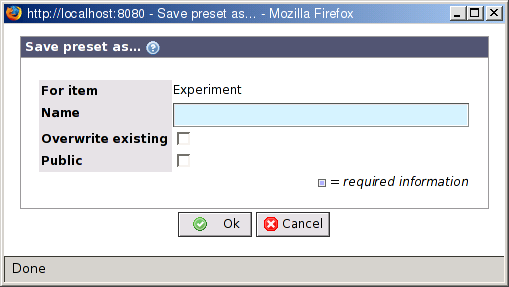
- For item
The type of item the preset is saved for.
- Name
The name of the preset. The name must be unique.
- Overwrite existing
If a preset with the same name already exists, it is overwritten if this checkbox is checked.
- Public
This options is only available for users which has the SHARE_TO_EVERYONE permission. If checked the preset is visible to all users.
Use the button to save the preset or the button to close the pop-up without saving.
If you select the Manage… option from the view / presets dropdown the Manage presets dialog is opened.
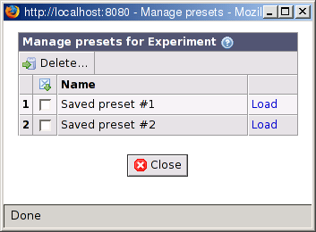
From this dialog you can delete or load presets.
To delete presets, first mark the checkbox in front of each preset you want to delete. Then, click on the button. You will get a warning about that the action cannot be undone. Unlike other items, the presets are not moved to the trashcan. Click on to delete the preset.
|
Edit a preset |
|---|---|
|
It is not possible to edit a preset directly. To change an existing preset you must:
|
Use the button to close the pop-up.